Ron Herman Website Redesign
Creative for Ron Herman.com

My sample for the Ron Herman redesign effort was intended to push the client somewhat past his comfort zone to identify some potential elements or treatments that might be used in other design concepts. The chosen concept (which won Virid a silver ADDY in 2011) was such a departure from this one that the work was simply shelved.
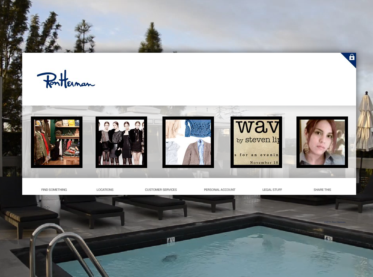
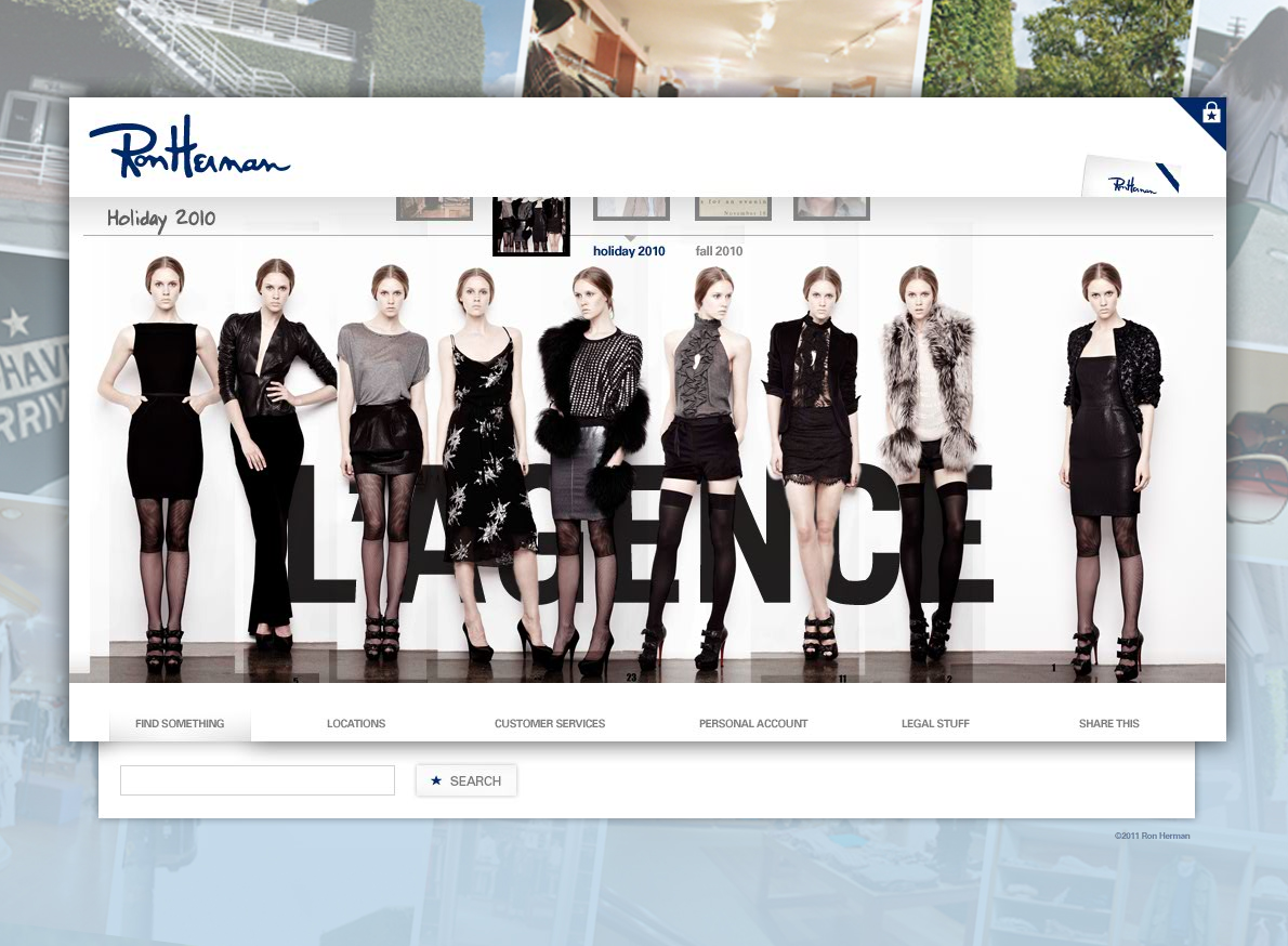
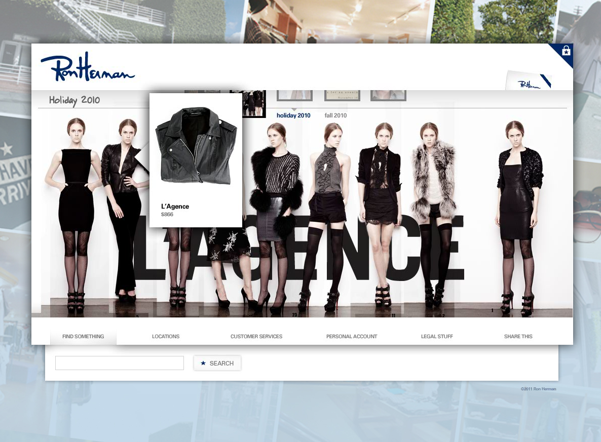
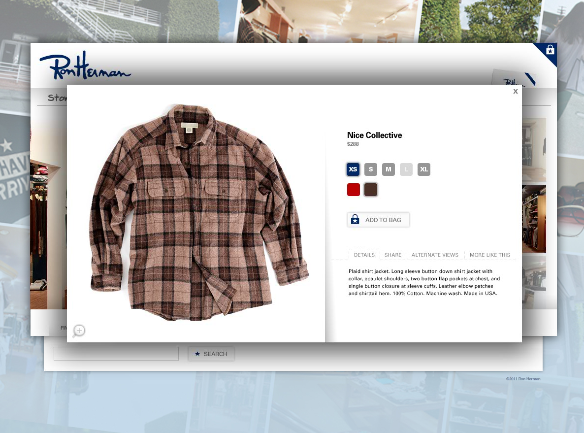
Regardless, it's a fine example of how a retail brand could develop a curated environment that's inclusive of product and editorial content while engaging with customers in a new and interesting way. The landing page is split into five rooms, each with a representative image that peaks the interest of visitors. The background of the site was designed to showcase large video loops of southern California culture to provide a place and establish life for the site experience.
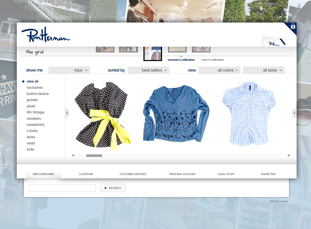
To overcome a lack of photographic assets, I suggested the use of existing room shots which would be updated daily with rollover access to product details that could be purchased in two clicks from the room view.
As with most retailers of his size, Ron Herman has to transcend the limitations of a small support staff. Designing a visually rich store experience that required as little ongoing maintenance as possible to retain freshness was achieved by leveraging assets that were known to be developed for other customer channels. Of course, that also aids in maintaining brand parity.
Regardless, it's a fine example of how a retail brand could develop a curated environment that's inclusive of product and editorial content while engaging with customers in a new and interesting way. The landing page is split into five rooms, each with a representative image that peaks the interest of visitors. The background of the site was designed to showcase large video loops of southern California culture to provide a place and establish life for the site experience.
To overcome a lack of photographic assets, I suggested the use of existing room shots which would be updated daily with rollover access to product details that could be purchased in two clicks from the room view.
As with most retailers of his size, Ron Herman has to transcend the limitations of a small support staff. Designing a visually rich store experience that required as little ongoing maintenance as possible to retain freshness was achieved by leveraging assets that were known to be developed for other customer channels. Of course, that also aids in maintaining brand parity.