philosophy redesign
Pitch work for Philosophy

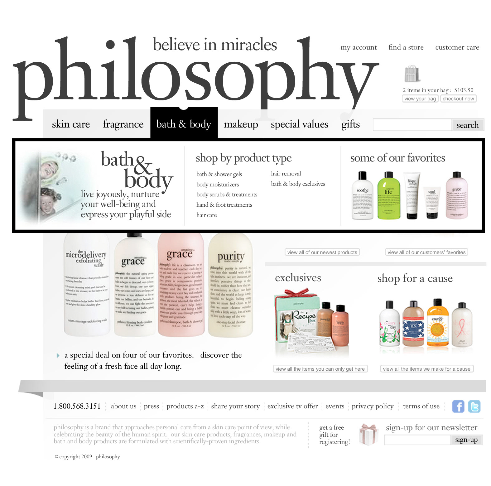
Homepage base design.
Homepage with top level navigation rollover.
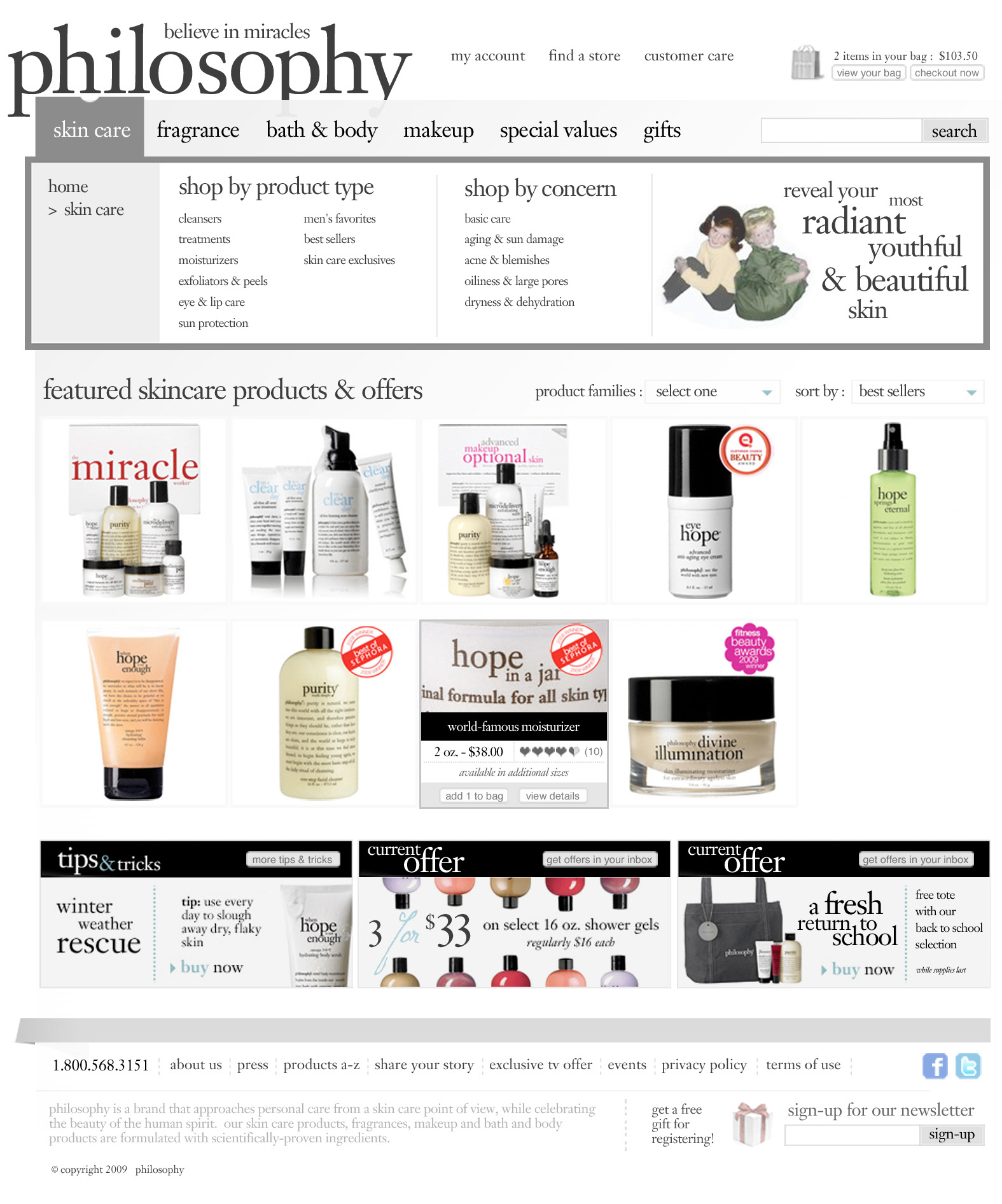
Skin Care listing page with user hovering over the product "Hope in a Jar" with featured quick-shop functionality.
Virid submitted an awesome proposal to philosophy and it appeared that we were top of the heap for a redesign effort. We flew out to present and what had started as a gimme ended as a comedy of errors. Between presenting comps with a substandard projector that sucked the subtlety out of three designs that used subtlety as a crutch and a limp presentation of the work by our team, it was no wonder that they were less than excited to continue.
However, the biggest setback was likely my contention that one of the core design elements that philosophy uses in marketing was something that they should work to minimize on their web site. That element? The cutesy hand-colored old photographs of kids doing things.
I felt strongly that while it might work well in print, that it may be something that may find itself into the site as a secondary support element, that the strength of philosophy's value was in the literary approach—the wry prose—used to position products and product families. The shape of the type used and the product packaging itself was therefore the design base for my direction.