A'GACI Redesign
A'GACI Webstore Redesign
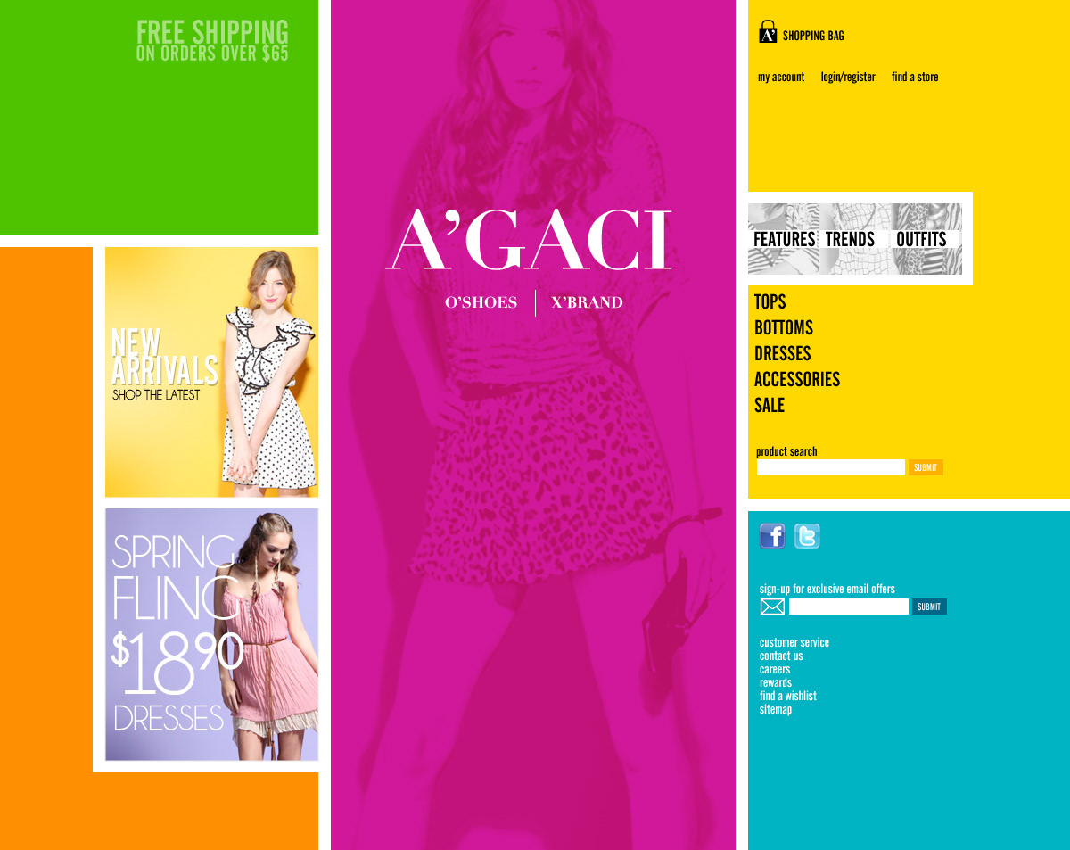


My approach to the A'GACI redesign project was to create a new interface style, as of yet unseen in retail that pushed navigation where I believe it belongs (logically) on the right, vertically, since you read first, and then navigate. It broke the content areas into reusable, flexible boxes, pushed the bright colors currently in-vogue (2010) in the tween market and made everything administerable via simple css modifications.
The final direction chosen by the client borrowed little from these concepts, but the current live site is a testament to the tenacity of the Virid team and the excellent lifestyle photography currently being created by A'GACI.
The final direction chosen by the client borrowed little from these concepts, but the current live site is a testament to the tenacity of the Virid team and the excellent lifestyle photography currently being created by A'GACI.